Monday 26 July 2010

Communicating - Or Just Making Pretty Shapes?

Do your prospects and customers find your messages hard to take in? It sounds crazy – but it happens most of the time.

Have you ever asked yourself why you communicate? Let’s face it: unless, like a politician, you suffer from a constant need to bore other people, you must have a purpose.

Maybe it’s to sell something: your product or service, or firm. Perhaps it’s to make something happen, or prevent it happening. Possibly it’s to clarify a misunderstanding or put over your point of view.

You may have many objectives. But whatever your purpose, I imagine you would agree it is, above all, essential that your audience understands what you are saying - quickly, easily and correctly. Otherwise, how are you to achieve your purpose?

Yet you may be surprised to know that many, perhaps most, printed commercial messages are ill understood by readers. The chief reason is that those who prepare them - writers and designers - know astoundingly little about what makes things easy to read.

For the most part, they rely on their own taste and judgement, or what is fashionable in “creative” circles. I put quotes round the word creative because, although the word implies originality, most slavishly follow whatever the current fad may be.

Slavish followers of fashion


Thus, if the fashion is for sans-serif type, or emphasising words regardless of their importance, or using certain words or phrases – like “strategic” or “key issues”, you will find many writers and art directors use them regardless of their suitability or how well they get your message across.

We can all have opinions about what we like, or what we think is tasteful, clever or well-arranged or visually exciting, but what really matters is, how well is your message conveyed? And oddly enough, a simple look at any daily paper reveals most of the principles.

The fundamental thing to recognise about words, type and layout is simple. They are tools to convey your message as clearly and quickly as possible. As the great typographical authority, Stanley Morison, noted: “Any disposition of type which, whatever the intention, comes between the reader and the meaning, is wrong”.

As you will see shortly, if you rely on taste, opinion or fashion the result is often disastrous; but happily, two men devoted many years to discovering how better use of language, type and layout makes for better communication.

Decades of research


One was Rudolph Flesch, an American, who studied what kinds and arrangements of words, sentences and paragraphs are most easily read. The other, an academic at the University of New South Wales called Colin Wheildon, conceived the idea of learning not whether people liked or disliked certain layouts or type styles, but how well they communicated.

He did this by taking some 200 Australian consumers, getting them to read certain passages laid-out in various ways, then asking them to describe what they had just read. He also asked them how easy they had found a particular piece to read. In other words he wanted to know how well different layout styles and typographic styles worked from a practical, not an aesthetic point of view.

The original research took over two years. As far as I know it is the most extensive and thorough of its kind. It has been extended and repeated over the 20-odd years since, and came out three years ago in a full-length book with the title 'Type and Layout'*. I recommend it if you want to make sure that whatever your message is, it gets through as well as possible.

In addition, since all messages aim to elicit a response – either, “yes, I understand” or “yes, I will do what you ask,” a lot of the results of direct response advertising can teach us lessons about what works and what doesn’t.

This piece distils some of the main things that have been learned from these three sources but the principal lesson is clear: people’s eyes and brains are lazy. If the eye has to adjust or make an effort, it will avoid doing so if possible. The same applies to the brain.

This should not surprise you: after all, how many business ideas – fast food, for example – succeed simply because people are lazy? First, let’s look at what has been learned about layout and typography.

A page of copy in serif type was comprehended well by 67% of readers. When the same copy was reset in sans serif, the figures nose-dived to 12%.


Why? Because the little “feet” on a line of serif type help keep people’s eyes on that line. So if you use sans serif type, make sure there’s plenty of leading – space – between the lines.


Perceived legibility of a series of headlines went down by over 20% when the setting was changed from capitals and lower case to capitals only. Imagine what happens to comprehension when someone sets a whole page in “caps” – which is quite the rage at the moment.


The eye recognises shapes, not individual letters, and a word set in caps has no shape, whereas the descenders and ascenders in caps and lower case give a word shape. What are descenders and ascenders? Well, in the word “shape”, h is an ascender and p is a descender.


Good comprehension slumped when type was set with ragged right setting (typically down from 67% to 38%) or, even more so with ragged left setting (67 down to 10 percent).


That’s because the eye has to adjust constantly. Often people set long passages “centred” – ragged on both sides. What do you suppose that does to comprehension?


For the same reason constant changes in typeface are not only ugly but confusing. This also applies to the needless changes in type size so fashionable amongst advertising agency art directors.


At least one person in ten has imperfect eyesight. So copy in very small type is usually unwise. And type set over tints or textures or colours so that it does not stand out clearly is fatal.


  • Type set in narrow columns is easy to read - the eye doesn’t have to travel so far. Around 50 characters per line is about as long as it should go.


  • Readers found headlines


laid out in a series

of “decks” or layers

like this were hard

to comprehend.

56% said they found headlines of more than four decks difficult.

Visual elements that point out of the layout - like people’s feet, or their sight lines - lead the readers out of the advertisement.


Illustrations that block off a column halfway down the page discourage the reader from travelling further.


Headlines marooned in the middle of the copy destroy the flow of that copy and halve good comprehension. So do headlines placed under the copy. The reader can’t be bothered to look up to the start of the copy.


Long, unbroken blocks of type are daunting. They should be broken up by crossheads, indents, and changes in type. Giving ‘shape’ to long letters also encourages readership.


  • Huge headings take up expensive space you have paid for and only work if you have readers with arms 8 feet long.


When a lot of type is reversed out white on black, it kills response. In the case of one full-page magazine advertisement, response doubled when white on black was replaced with the normal black on white.


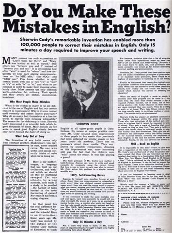
Captions are heavily read. If you run a picture without a caption, you lose the chance to communicate.


  • Pictures of people’s faces gain enormous attention. Use them wherever you can.


Techniques that make for easier reading


If you buy The Wall Street Journal you will see how surprisingly easy the front page is to read. That is because it follows the rules laid down by Rudolph Flesch.


Best sellers and tabloid newspapers adhere to these techniques, as do direct response copywriters. They all have to make reading easy. Otherwise they go broke.


Sentences should be short. An average 16 words per sentence is ideal. The easiest sentence to read contains eight words. The average reader finds anything longer than 32 words hard to take in.


Paragraphs should be short, containing just one thought in each particularly the first paragraph.


  • However, vary sentence and paragraph lengths to avoid dullness.


Words should be short and lively, not long and dull: eg, buy, not purchase; free. Not complimentary.


  • Never use unnecessary words: eg, “for free” should be “free”; “miss out on” should be “miss”; “male personnel” should be “men”.


You”, “yours” and “your” should appear 2-3 times more than “I”, “we”, “our”, “us” and “ours”. That’s because readers are interested in themselves – just as you are.


Use words and phrases at paragraph beginnings that encourage continued reading - like “And”, “Moreover”, “That is why” and “What’s more”. If you put questions at paragraph ends, this helps too. Why?


Because reader wants to know the answer – which is why you just read this sentence.

If you break sentences at the ends of pages and columns, this also encourages continued reading. Put ‘Please turn over’ or the like at the end of a letter page.


There are other points well worth knowing, but that’s all I have room for here. Thanks for reading through to the end; I hope you found it easy - and clear.

Best,
Drayton
www.directmarketingcourse.com
www.commonsensedirectmarketing.com

Sunday 25 July 2010

Who Have You Read Lately?

A couple of days ago I sat through a course on writing by Drayton Bird, along with 40 or so other people.

The good thing was, although it was a live seminar, I didn't have to leave the comfort of my home: It was a webinar.

This was one of three webinars Drayton is holding on learning how to write to persuade.

And one thing he emphasized, along with many others, is the importance of reading. Not reading books on writing, or marketing, or any type of business book.

The books he told us to read are novels. And not just any novels, but novels written by people who know, or knew (some may or may not be alive now), how to write.

You see, these people write in such a way that you can't resist reading on. Their style of writing compels you to read from beginning to end.

One author I find unable to put down is Agatha Christie. I never used to read her books until Matt Furey recommended them in one of his emails.

Now I'm hooked.

The thing with Agatha Christie, and the ones on Drayton's list,  is that if you read them you can see why they're so good.

And, if you follow the way they write, it can only make your own writing much better.

And that includes copywriting.

If you want to know more about the writing course, go here http://www.draytonbird.com/proper. That's not an affiliate link.

Meanwhile, it just so happens I found a very interesting piece on the importance of reading. It was written almost a hundred years ago by one of the founders of the BBD&O advertising agency, Bruce Barton.

It's a short but compelling piece. I enjoyed reading it. I think you will, too.

Take it away, Bruce.

Your Body May Live In The Cellar; But It's Your Own Fault If Your Mind Lives There

THE other night my friend Ferrero and I spent a few years with Julius Caesar in ancient Rome.

We went with him on his campaigns in Gaul. Those were wonderful battles -- wonderful fighters.

From a hill-top we could watch the whole battle -- thousands of men driving at each other with their swords, hurling their javelins at short range. No smoke, no trenches; just primitive, hand-to-hand conflict.

We came back to Rome. The city was in a turmoil. Our great chariots thundered through the streets in triumph; our captives, our spoils, our banners made a magnificent procession. The crowds cheered wildly.

Another evening my friend Green and I had a great time together in ancient
Britain.

We went down to Runnymede with a group of English nobles. They were powerful men, each a petty king in his own section; but every one of them took his life in his hand on that expedition.

And there we gathered around King John, and forced him, against his will, to put his name to the Magna Carta, the Great Charter which is the foundation of
English liberties -- and our own.

I had a fine time with Napoleon a few nights before.

I met him when he landed in France, after the escape from Elba.

Up through the southern provinces he came, gathering a few troops there, winning over by the force of his eloquence the regiments sent to capture him.

We arrived in Paris. Hurriedly, but with supreme confidence that the Little
Corporal could never fail; we got together a makeshift army and set out to strike the winning blow at Waterloo.

That battle -- I shall never forget it.

Another day I went over to old Concord, and spent the whole afternoon with Emerson.

We talked about Representative Men. Well, well, you say, what foolishness is this? What do you mean by saying you lived with Caesar and Napoleon and Emerson -- all centuries apart, all long since dead?

If you do not know what I mean, then I pity you.

Have you never come home tired from your office, and with a book transported your foolish little mind clear out of the present day?

Have you never learned the joy of surrendering yourself to the companionship of the great men of the past?

Have you never sat in the little London Club and heard Sam Johnson thunder his philosophy of life?

Have you never sailed up and down the American coast with Captain John Smith, dodging the Indians and opening up a new continent?

Are you one of the wretched, poverty stricken souls who have never learned to escape from yourself through the blessed magic of good books?

Have you contented yourself all your life with the companionship of good pinochle-players, when you might have been a familiar friend of Socrates and
Milton and Napoleon and Cromwell and Washington and Columbus and Shakespeare and Lincoln and Rousseau?

If so, cut out this paragraph from a great man and paste it in your hat:

I would rather be a  beggary and dwell in a garret, than a king who did not love books.

There are some marvellous experiences coming to you.

You can in the evenings to come jar yourself out of the petty rut where circumstance has placed you, and become a familiar of the immortals.

You may learn to face the world with a new confidence, a new poise, a new self respect, because you have made yourself a citizen of the ages.

Do some real reading.

Do it for the joy it will give you: Do it for the good it will do you.

"Show me a family of readers,” said Napoleon, “and I will show you the people who rule the world."

Best,
Rezbi
www.directmarketingcourse.com
www.commonsensedirectmarketing.com

Friday 23 July 2010

Failure - A Friendly Kick Up The Backside

I'm a lazy sod given half a chance, so I thought I'd let an old friend do a bit of work.

Christian Digby-Firth was one of my creative directors years ago at O & M and has a very neat turn of phrase.

Good writing is always a good thing to note if you want good people, since as Dr. Johnson observed, "Language is the dress of thought."

Here's something Christian sent me just now.

"What is it about airport ads? They're breeding grounds for some of the most fatuous copy lines in the biz. "We know what it takes to be a Tiger", "In business people are good together", "Hello", etc. etc and all the others too crushingly dull to recall. Which is of course your point.

International committee work, I suppose.

"Make the most of now" is Vodafone's anxious strategic imperative writ large: i.e. "Please use your mobile phone to do all sorts of things that are pointless to you but profitable to us, and do them now because we don't make anything on your boring old voice calls".

Now, I have to confess that though I agree with almost everything in that hilarious little note, I don't agree with that.

I think the Tiger campaign is very cleverly aimed at executives with very small p**cks and even smaller minds who want to feel like they're big bold business marauders - and who are gullible enough to believe Accenture will help them do it without having to think, in exchange for absurdly large sums of money.

But there is an important point I want to make (besides one I made in an earlier piece, which is that emotion beats logic, even in business).

It's: Playing on people's inadequacies is a very smart thing to do.

Take a look at any successful self-help ad, and you'll see what they do.

I mentioned Max Sackheim a week or so ago - the man who wrote "My First 50 years in Advertising".

He wrote an ad entitled, "Do you make these mistakes in English?" aimed to sell English courses to immigrants who felt unsure about their English. It ran successfully for 40 years.

Here it is:


Lillian Eichler wrote an ad with the heading, "Again she orders - A Chicken Salad, Please." - to sell a book of etiquette to people who felt socially inadequate.

It took three writers to produce an ad headed, "Here's an extra $50, Grace - I'm making real money now" - aimed to sell correspondence courses. This is one of my favourite headlines ever..

Now, I hope you're not going to give me that bleeding heart stuff about playing on people's fears. If you do I will tell you one thing I know for sure, in fact I bet on it once..

Recently I was speaking at Manchester University, and the celebrity speaker was a famous chef. I was discussing what motivates successful people with a lady at my table..

I said, "It's fear of failure - and I bet this man is no exception."

The man's speech began almost word for word with what I'd said. He revealed how he feared not living up to his father's expectations..

People who achieve do so almost always because they fear to fail..

And people who fail usually do so because they're cocksure -not worried about failing, and so don't try hard enough.

Best,
Drayton
www.directmarketingcourse.com
www.commonsensedirectmarketing.com

Monday 5 July 2010

"The Greatest DM Creative Of This Generation"

This is Steve Harrison...
"The greatest DM creative of this generation."

A bold claim, you might say, but that's not me saying it. It was a claim made by the UK’s leading advertising journal, Campaign magazine.


Steve was one of the presenters at the direct marketing course ran by Drayton Bird's European Academy of Direct and Interactive Marketing, or EADIM for short.

Let me tell you, Steve alone was worth the fee for the course.

And that's saying something when you consider some of the industry's biggest hitters were also there presenting.

It's happening again starting this October. I'll give you more details soon.

Best,
Rezbi
www.eadim.com
www.commonsensedirectmarketing.com

Thursday 1 July 2010

How Often Should You Talk Yo Your Customers?

This video may sound a bit like it was recorded in a municipal swimming baths (actually it was my partner Al'S quaint West Country residence) but once you've got over that, you may find it useful.


That's because it deals with something I must have been asked a thousand times: how often should I mail/email my clients?

This reminds me of another hoary old favourite: how long should the copy be?

And both remind me of the philosopher Bertrand Russell's remark that "What men seek is not knowledge, but certainty."

Some people think they should be talking more often, lest their customers think they are being ignored; others think they should talk less for fear of boring them.

The truth is, as so often, that it depends on a myriad things. In this 2 minute 6 second clip I get pretty excited about the subject - but don't let that put you off.

By the way, I have just finished putting together the examples for the first How to Write Proper webinar.

Best,
Drayton
www.eadim.com
www.commonsensedirectmarketing.com